问题:
The table below shows a company's sales figures for the first six months of the year.What kind of graph or chart would you use to show the fluctuations of total monthly sales figures across the six months?
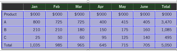
The table below shows a company's sales figures for the first six months of the year.What kind of graph or chart would you use to show the fluctuations of total monthly sales figures across the six months?
参考答案: